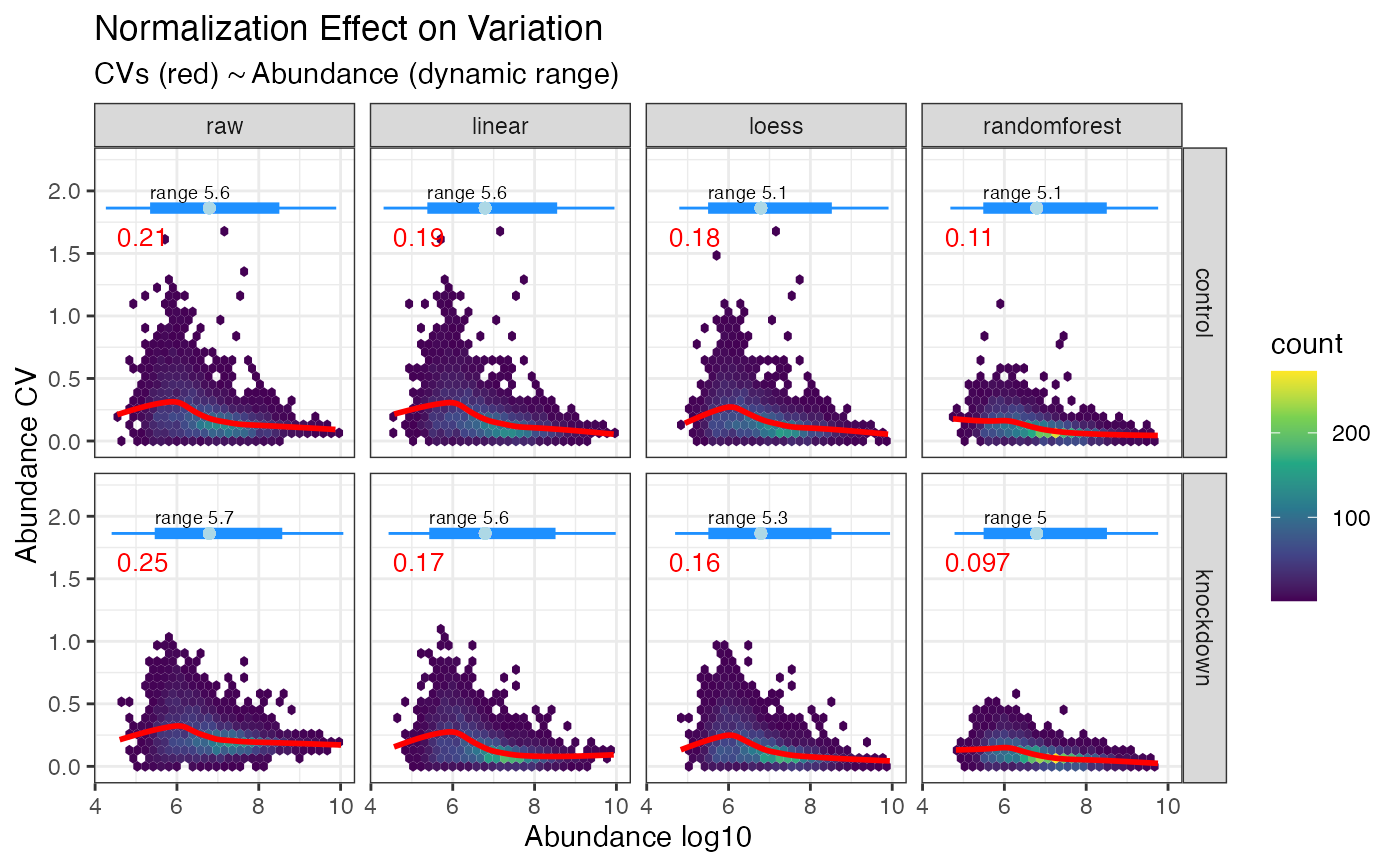
Plot CVs by abundance
plot_dynamic_range.Rdplot_dynamic_range() is a GGplot2 implementation for plotting the normalization
effects on CVs by abundance, visualized as a 2d density plot. Layered on top
is a loess smoothed regression of the CVs by abundance, with the median CV
shown in red and the dynamic range represented as a box plot on top. The
point of this plot is to examine how CVs were minimized through out the abundance
profile. Some normalization methods function well at high abundance yet leave
retain high CVs at lower abundance.
Examples
library(dplyr, warn.conflicts = FALSE)
library(tidyproteomics)
hela_proteins %>%
  normalize(.method = c("linear", "loess", "randomforest")) %>%
  plot_dynamic_range()
#> ℹ Normalizing quantitative data
#> ℹ ... using linear regression
#> ✔ ... using linear regression [250ms]
#>
#> ℹ ... using loess regression
#> ✔ ... using loess regression [1.3s]
#>
#> ℹ ... using randomforest regression
#> ✔ ... using randomforest regression [33.1s]
#>
#> ℹ Selecting best normalization method
#> ✔ Selecting best normalization method ... done
#>
#> ℹ  ... selected randomforest
#> Warning: All aesthetics have length 1, but the data has 40608 rows.
#> ℹ Please consider using `annotate()` or provide this layer with data containing
#>   a single row.