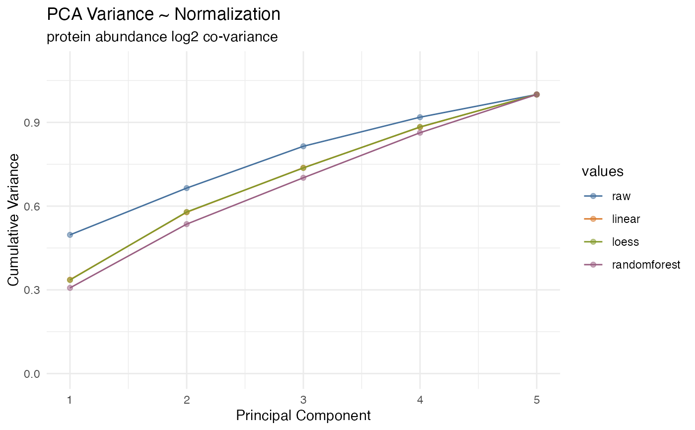
Plot the PCA variation in normalized values
plot_variation_pca.Rdplot_variation_pca() is a GGplot2 implementation for plotting the variability in
normalized values by PCA analysis, generating two facets. The left facet is a plot of CVs for
each normalization method. The right facet is a plot of the 95%CI in abundance,
essentially the conservative dynamic range. The goal is to select a normalization
method that minimizes CVs while also retaining the dynamic range.
Examples
library(dplyr, warn.conflicts = FALSE)
library(tidyproteomics)
hela_proteins %>%
  normalize(.method = c("linear", "loess", "randomforest")) %>%
  plot_variation_pca()
#> ℹ Normalizing quantitative data
#> ℹ ... using linear regression
#> ✔ ... using linear regression [219ms]
#>
#> ℹ ... using loess regression
#> ✔ ... using loess regression [1.3s]
#>
#> ℹ ... using randomforest regression
#> ✔ ... using randomforest regression [33.6s]
#>
#> ℹ Selecting best normalization method
#> ✔ Selecting best normalization method ... done
#>
#> ℹ  ... selected randomforest